
By Steve Lange, managing member, ProcessDev LLC
Increased availability of sensors and data provides new opportunities to improve quality and process reliability in converting processes. This three-part series covers the process of effectively leveraging data while avoiding pitfalls. Part 1: Preparing for a Converting Process Data Project covered the necessary actions to ensure the right data are gathered in the right ways for the right reasons. Part 2: Converting Process Data Wranglingdescribes the steps of aggregating, cleaning and exploring data. Part 3: Converting Process Data Analytics Implementationwill outline analysis methods and tips for applying and preserving analysis insights.
Data collection and aggregation
In Part 1 of this three-part series on leveraging data in converting operations, the focus was on laying the groundwork for a successful data project. In Part 2, we continue down the road of collecting data of interest and preparing it for analysis.
Often to answer important questions or make meaningful improvements, siloed data must be brought together to enable novel insights to be generated. Data from process historians, quality data from laboratory measurements, customer-complaint data, maintenance records, raw-material and product-design data and financial data might need to be combined to get a full picture of what is driving the business results of a converting operation. These data often are stored in legacy databases controlled by different organizations. Depending on the scale of the operation, data might be stored for individual machines of different generations or in different manufacturing sites using different software to store and access the data. The data may be stored in dedicated servers on-site or in the Cloud or on an individual laptop in a lab or a converting line.
So, the first step often is investigative in nature, to understand the data landscape and the data model of each silo. Learning what data are available, where it is stored (on-site or in the Cloud), who controls the access and how to securely access the data are all required. Learning what each data field is and its context will save time later when trying to relate various data variables to each other.
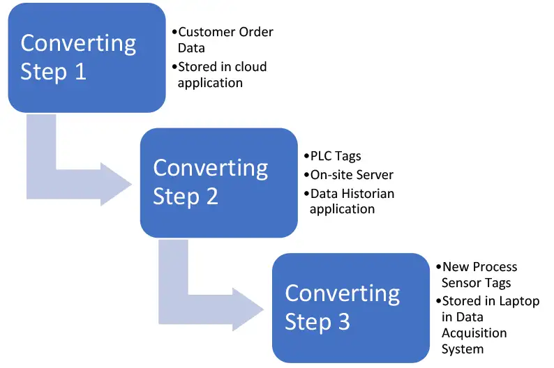
Once this is done for each dataset of interest to be aggregated, drawing a diagram of the data relationships between datasets and the variables in them will provide a high-level model of your understanding of the data (see Figure 1). This map can be drawn for an individual process step, for several process steps in a single manufacturing line, for several manufacturing lines in a plant or for several lines in several plants. The scale of the data project depends on the business opportunity or issue being addressed.
Then the data will need to be joined to enable the tags and data fields to be analyzed together. There are many commercial and open-source database-software packages and programming languages for joining and relating data for analysis. A large part of the initial effort may be in helping your organization select the right option for storing and joining data, and many factors will apply, including the amount of your data, data-security requirements, how quickly the data must be analyzed, the state of your data-science capabilities in terms of people capability and capacity and, of course, the budget. Data engineers have expertise relevant to this phase of the project.
Cleaning and preparing data
Neither sensors and software nor the humans who design and maintain them are perfect, so various errors can occur in datasets. Examples of data errors can include:
- Negative values that are not physically possible
- Zero values where there should be none
- Missing data. Decisions on how to handle them often are required because some modeling techniques will not deal well with missing values, but throwing out too many observations with missing values might reduce your model effectiveness.
- Lots of 9s (999, etc.) that may occur from a sensor hitting a measurement limit
- Duplicates
- Outliers (which might be true outliers, or could be valid datapoints signaling a process change)
- Periods of machine downtime that might not be relevant for an analysis
- Periods of machine ramp-ups or downs or roll-splice events that might be relevant or not, depending on the analysis goal. As many issues occur during non-steady-state events, these can be particularly good places to focus attention.
Algorithms that check for these problems can be used, as well as visualizations illustrated below. Decisions must be made on whether to exclude certain data as outliers, inputing missing data using methods such as interpolation, assuming the last known value or replacing the missing values with the average. These decisions can be aided by statistical rules but benefit greatly from subject-matter expertise and experience. Operators, process and maintenance engineers who know how the process and equipment normally operate have learned patterns from observation, so their involvement in data cleaning, such as helping build data-cleaning algorithms, is especially useful.
Rate sensitivity and order-of-operation effects: Another consideration in converting data is that they usually are time-series in nature, meaning they are collected over time at some interval. However, not all the process variables might be collected at the same frequency or have the effect on key performance indicators (KPIs) over time. Also, there can be order-of-operation effects where downstream processes are affected by upstream process states that occur at earlier times.
Understanding the rate sensitivity of each process step in terms of its primary effects on what matters to the customer can be particularly important when trying to make sense of data and relationships between variables. For example, are the KPIs of the process step the result of process operations that happen in milliseconds, or months later due to aging effects, or both? If the process data stream is not sampled at the right frequency, the ability to model and predict the behavior will be impossible.
Which upstream operations and variables have the greatest effects on which downstream operations? For example, the variation of film thickness during extrusion upstream can affect the wrinkling and steering behavior of the moving web downstream and the internal stresses in a wound roll over time during storage.
Much of this understanding is learned from experience, and some can be discerned from process modeling/simulation, designed experiments and data analytics. Predicting some of the behaviors of the process in advance of complex analysis can aid in checking for the reasonableness of the data before building models.
Exploratory data analysis
Once data have been prepared for analysis, an initial survey is useful to focus attention on the most useful areas for deeper analysis. A significant portion of human brain power is devoted to visual signal processing [1]. It makes sense that visualizing data in graphical outputs as a first step is an efficient method if humans are engaged with the data. Many graphical plot styles are available, including run charts, histograms, box and violin plots, and scatter plots. Plots can reveal more about the data than tables of summary statistics that can be the same for quite different datasets.
In converting operations, both in web-making processes and converting processes, sensors exist that can measure the state of the process and of the web. Web tension, web temperature and humidity, and web lateral position are examples of common measurements [2,3,4].
For the purpose of illustrating various plots below for data visualization, a simulated dataset was created for three measurements taken at the same position in a hypothetical web-converting process at 1-sec intervals: web tension, web temperature and web lateral position from machine centerline.
Run Charts: The most intuitive visualization is to plot the measured variables versus time (see Figures 2-4).
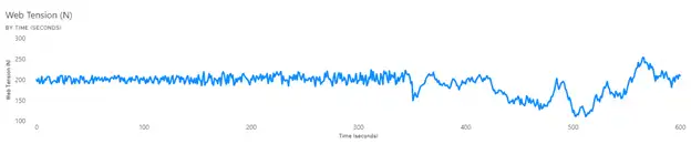
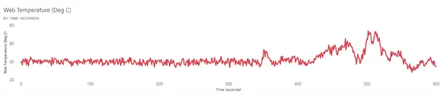
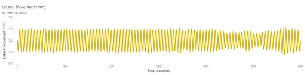
The web tension and temperature appear to have a stable period before a period of instability that begins at the same time. More context from operators or other data to explain the basic cause would be needed. It often is the case that without having data in the dataset that provides this context or showing the data to operators who can help explain the behavior, the visualization is just the first step in gaining understanding. For example, was a roll change initiated that introduced a web with high variation in properties, or was a failure in the web heating-control system the key issue? The lateral movement of the web is sinusoidal in nature, and this pattern can be a clue as to the root cause, such as a poorly tuned web guide or wobbly unwinding roll.
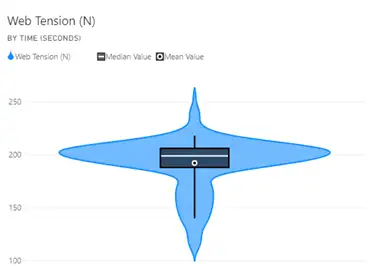
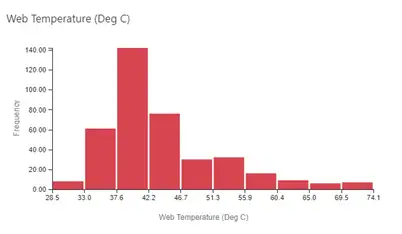
Distribution Plots: Seeing the overall spread of the data can be useful in understanding the range of variation and the nature of it. Figures 5 and 6 show a histogram and a violin plot, respectively. This histogram requires selection of the bins into which the data are collected, which can affect the appearance of the plot. The violin plot provides a way to see the mean, median and the data density at different values.
Scatter Plots: Plotting variables against each other can be revealing as to whether they are significantly correlated. Figure 7 shows a plot of web tension versus web temperature. While correlation is not causation, this type of plot can support relationships between variables known from first principles or experience or reveal a relationship not known or that has emerged because of an anomalous event.
Dashboards: When a collection of commonly used plots has been generated and found to be useful by the customers of the analysis, they can be curated into a dashboard that can be available to the customers for periodic review. A dashboard can include virtual gauges as well as some of the examples from above. Alerts can be set up (i.e., for KPIs that go out of limits, to be sent to people who can resolve the issue).
Summary
Before the value of deriving insights from converting data can be realized, the diligent work of collecting data from different sources, understanding its context, merging it as appropriate and cleaning it are necessary steps for success. Understanding the process in terms of known data relationships from modeling/simulation and experimentation can aid in data cleaning and model building. Before diving into complex modeling of the data, visualizing it can reveal data errors not found in the data-cleaning step and provide early insights.

In Part 3 of this series, some available data-analysis methods will be outlined and tips for applying and preserving hard-won insights will be offered.
References
- Hagen, Susan, “The Mind’s Eye.” Rochester Review, March-April 2012, Vol. 74, No. 4.
- Linna, H., Moilanen, P., Mahonen, A. and Parola, M., “Variation of the Web Tension at the Roll Change in the Printing Press,” Proceedings of the Third International Conference on Web Handling, June 1995, https://hdl.handle.net/11244/321692
- Parent, F. and Hamel, J., “Evaluating the Impact of Non-Uniform Paper Properties on Web Lateral Instability on Printing Presses,” Proceedings of the Twelfth International Conference on Web Handling, June 2013, https://hdl.handle.net/11244/322005
- Lu, Youwei, “Modeling and Control of Transport Behavior of Moving Webs Through Heat Transfer Processes,” Doctoral Dissertation, July 2015, Oklahoma State University, https://hdl.handle.net/11244/45277

Steve Lange is managing member of ProcessDev LLC, a manufacturing-process development consulting company. He is a retired Research Fellow from the Procter & Gamble Co., where he spent 35 years developing web-converting processes for consumer products and as an internal trainer of web-handling, modeling/simulation and data analytics. Steve can be reached at 513-886-4538, email: stevelange@processdev.net or www.processdev.net.